Cover art – building a brand


It wasn’t too long ago that I worked with my amazing cover artist, Loretta Matson, on the cover of my newest release, Blogger Girl. I told Loretta that I wanted the cover to give off a fun “chick lit” vibe. The main character of the novel, Kimberly Long, is a loyal defender of chick lit – the easy breezy writing style, the humorous tone, the happily ever after etc. – and I wanted the cover to reflect that. It seems that many American chick lit writers are moving away from illustrated covers but I personally love them. I am my own target audience and am more likely to click on an illustrated cover on Amazon than a photograph because illustrations, to me, scream “chick lit” and chick lit is my favorite genre. But I had more on my mind when creating the cover of Blogger Girl than just the illustration. I wanted the cover to fit into my brand.
When my debut novel, Just Friends with Benefits, was being published and I worked with the designer on the cover art, I didn’t give any thought to future books I would write and how I would want their covers to look. I was a newbie in the business and gave no thought to my “brand” because I didn’t have one yet. I also did not give my brand much thought when working on the cover for my second novel, A State of Jane. But I absolutely loved the cover of A State of Jane and knew that I wanted the cover of Blogger Girl to give off the same fun vibe.
Responsibility for the cover design of Blogger Girl was shared by Loretta as the designer, me as the author and Beth Bacon as my book manager and there was a lot of back and forth between the three of us before it was completed. Once we were finished, we immediately got started on the new cover of Just Friends with Benefits as I had just assigned the rights to Booktrope. With building my brand as one of our biggest goals, we wanted all three books to share certain elements that would distinguish them as books by “Meredith Schorr” while making it clear that they were stand-alone novels and not part of a series. This is what we came up with:
The title of all three books is in the same font.
One letter in each title is dotted with a “heart” design.
My name is placed in the same spot on each book and also in the same font.
The back covers all include two endorsements, one before and one after the blurb.
The first sentence of the blurb is written in the same font as the title and in a larger size than the remaining text.
My photograph appears to the left of my bio on the bottom of the back cover.
Finally, on the spine of both Blogger Girl and Just Friends with Benefits is a smaller image of one of the designs featured on the front cover. On Blogger Girl, it is the image of Kim; on Just Friends with Benefits, it is the image of a candy heart. Although we did not do this with A State of Jane, it is a feature I definitely want to include in my future books.
For any authors reading this blog, do you focus on your “brand” when designing your covers? If so, in what ways? If not, is it something you would ever consider in the future?
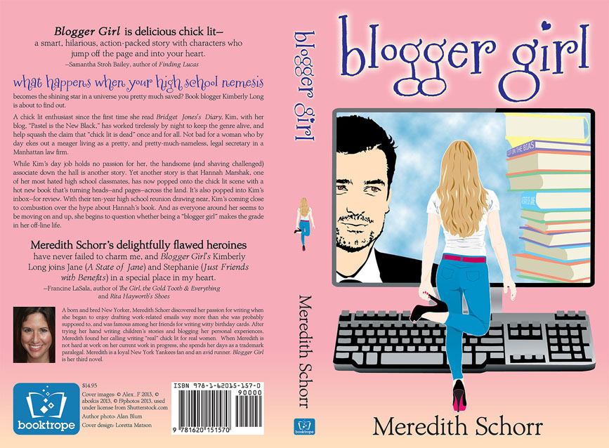
Blogger Girl – Full Cover

Just Friends with Benefits – Full Cover
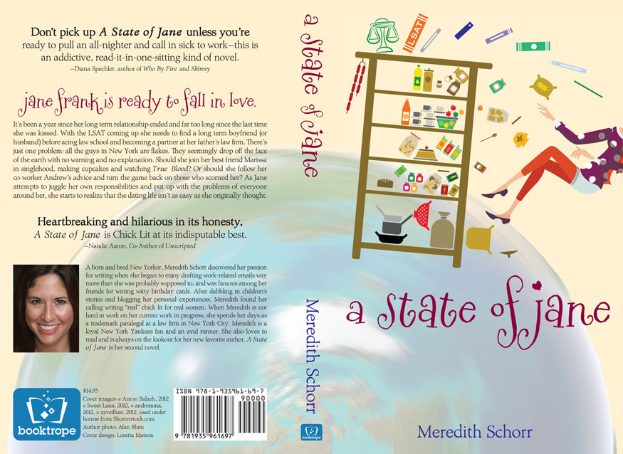
A State of Jane – full cover

Loving all three covers. They definitely do what you were looking to do. I see them and I think Fun Chick Lit, and the common threads jump out at you.
Thank you Justine! I’m very happy that my covers are sending the right message 🙂
Love seeing them all layed out and noticing the details that make them yours. Looks awesome! And it’s a really great idea!
Thank you Cindy!